Web Design - Team Website MMc403.3
(Due 8.30 03/03/17)
Research blog- (35% research)
- Show a thorough research process
- Use and Show an understanding of the Design Process
- Demonstrate individual contributions
- Show exploration of Typography, colour Scheme, Imagery and pattern-styles etc…
- Show which/how tools were used [I.e illustrator, sublime text]
Project work-(65% project)
- Provide a detailed action plan that breaks down how your team managed and developed your website over time - What task was completed by who - what time/date tasks were completed
- Show how your team has used the commit mechanism on githuub
- Coding needs to be clean and easy to understand -show how anyone could take over the development of the website by leaving notes in the code
Contributors:
Ryan bugg [Developer][Researcher][Designer]
Jonathan Verma[Project manager][researcher][Designer][developer]
Research process -
Completed 8/2/17 - by Ryan Bugg
To show a thorough research process i will keep this blog updated with links, images etc, to videos and coding tutorials and any other resource i used to successfully come to a final idea and completion of this project. Starting of with the design process, over the past few weeks we have looked into depth, flexible images and flexbox these will be a good starting point to the research as our website will need to be fully functioning and work across multiple platforms such as tablets and mobile devices and flexbox is a brilliantly simple way of achieving this. The first link i will include is a youtube video, a tutorial into flexbox and 5 examples of it in use along with a link to obtain the code.
In the video, we are shown how to set up multiple columns in various layouts and how to have them change display when the screen size is below and specified number of pixels,we also shown how we can arrange their order easily using the flexbox code.

Another use of flexbox shown is how to use it to extend a input field to the end of its container or extend it point and make two input fields finish level when the start points are not.


Third use of flexbox is using it to create a featurette that we move from rows to columns and space equally using flexbox as oppose to having to to the complicated way of working out the size of the body and enter it in pixels, using flexbox allows more flexibility and easy styling of features on the website and how to make it responsive


The fourth example is multiple rows of items and making them responsive to different media outlets. As you can see from the images below the items start to stack when the width of the body reaches the specified number.


This example is simple centering, centering text without the complication of having to code it to pixels, using flexbox it will automatically centre even when the size has changed.


This example is columns and rows, once again it also shows how make they responsive to different media outlets.


Tools used
Sublime text
Completed 8/2/17 - by Ryan Bugg
We will be using a great program called “sublime text” this is a coding program, it is brilliant as you are able to code everything from html,css,javascript and more simultaneously as it allows you to open multiple files at the same time and you are able to code some html in one column, edit the css for it in the second, and give it javascript in the third. Along with its autocomplete syntax it's a very fast and efficient way of coding for everyone of all abilities.
Google chrome
Completed 8/2/17 - by Ryan Bugg
Google chrome will be key in this project as due to their vast range of feature it allows me and other team member to edit documents simultaneously comment on each other's work and discuss possible changes in our document work without it having to be in the document by using the comment feature, simply highlight with your mouse the area you wish to make a comment about and click comments it then creates the comment. Look at this example.

Invision
This is a design tool that lets you design files add animations and transitions to static web designs. it is a window into your work and helps you in vision your website and helps you understand what you are trying to design.

Cooler Colour
"Coolors, a web and iOS app that lets you generate an infinite number of colour palettes by tapping your keyboard like a button on a slot machine. With each tap, a new palette appears on your screen, split into five hue-filled windows. Not crazy about the scheme over all but see an individual colour you like? Click it and Coolors will isolate that colour; every subsequent tap of the space bar generates a new palette in accordance to your choice colour(s)."
https://coolors.co/f55d3e-878e88-f7cb15-9c66d6-76bed0

Github
Completed 8/2/17 - by Ryan Bugg
Github is a free to access website and application that allows you to link you coding files with it, giving you previous copies of your work so you can back track through your progress and changes should you need to but it also allows you and someone else to work on the same work without the hassle of sharing it through email and then being one step behind one another, it allows you to both work on it simultaneously and have access to all the changes as soon as they are made, this is core in a group project such as ours.
Typography Research
In a 1997 journal of marketing paper by jennifer aaker, it showed how for a fast food chain called wendy's, more people were willing to believe their claim of being old fashioned when the font was chained. The paper shows how emotional response of typography establishes connotations with shoppers perceptions of a brand and product.
Typography is a visual art, it's important make the right choice when choosing typography, you need to choose something that helps your brand and product, its very easy to just choose any type but what works for one brand or product may not work for yours, for example
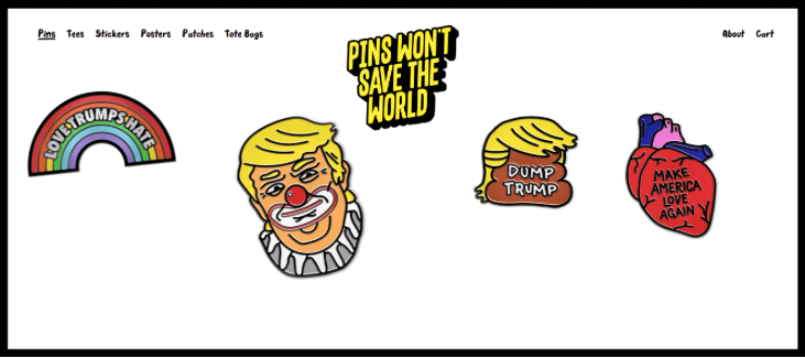
Pins won't save the world have this cartoon look with their typography which fits their brand perfectly but when it comes to using this font type on an ecommerce website it could lead the audience misinterpreting your brand as a joke or not as serious as you would like.
There are 3 points to look at when deciding on a font to make sure its the right one for your goals,
know your audience, just like the content you want the typography to match your ideal audience such as young, casual , bold, old fashioned, formal, the list goes on. So choose the one that best speaks to your target audience.
Know your brand, the font also mirrors the personality of your brand, in addition to speaking in a voice that your readers can perceive and relate to, you want it to represent your brand's identity, but it shouldn't just reflect your brand's personality it should also make your brand likeable.
Suit the message of the content, the worst thing you can do is mess up the meaning or mood of the benad by using the wrong typeface and the values you want to convey, make sure the font is appropriate for what the text itself is communicating.
Another thing when choosing a typeface is not to many, no more than two, using to many font is a mistake, there is a misconception that more fonts make the page more visually exciting, however at some point the variety stops adding to the page and starts taking away from it, and that turning point is usually after two different fonts.
Other E-commerce websites:


The psychology of colour in E-commerce
the first step to understanding colour in E-commerce is understanding the attributes of colour. I found an online article that talks in depth about Colour theory in Ecommerce.
source: https://woocommerce.com/2014/07/psychology-color-e-commerce/
- White: Purity.
- Black: Powerful. Mystery.
- Brown: Protection. Wealth.
- Blue: Trust. Integrity. And in some cases, frigidity.
- Green: Growth.
- Yellow: Intellect. Cheerful.
- Orange: Optimism.
- Red: Exciting. Promotes action.
"When putting together the design for your website, it’s very important to consider not just what colour(s) you use but how you use them. There are actually some best practices you need to be aware of. Here are some tried and true rules that should prove helpful when thinking about how to incorporate a target colour into your design:
Beware of Overuse
There is such a thing as too much of a good thing.
Setting the background colour, buttons, headers, and everything else various shades of green isn’t exactly the best approach. The site will likely be unattractive at the very least.
Colour overuse can also have the opposite effect you intended when beginning the design process. The chosen colour won’t stand out at all and won’t produce the right feelings in your target customer. Talk about a waste of time and effort! "
Design Process
- Brief (make detailed notes)
- Research- search for e-commerce businesses, Different E-commerce websites and What techniques are used)
- Create a detailed action plan
- Moodboards, style tiles, wireframes and web designs
- Style guides
- Present
Action Plan
Date
|
Tasks
|
Week beginning: 06/02/17
|
Initial research: (research E Commerce businesses and websites for inspiration)
Research: (typography, colour schemes, patterns and imagery)
Research: (Flexbox and web-layout techniques)
|
Week beginning:
13/02/17
|
Begin the design process:
-Moodboards
-Style Tiles (colour theme, fonts, imagery)
-Wireframes (the journey the user goes on)
-Web designs
|
Week beginning:
20/02/17
|
-Create style guides
Begin Building process:
-HTML code
-CSS
-Java script
|
Week beginning:
27/02/17
|
Finalise Building =;
-HTML
-CSS
-Java script
Update Github with final website
-Write presentation
|
DEADLINE:
08/03/17
|
Present
|
Completed by Ryan :
|
Colour RED
|
Completed by Jon :
|
Colour BLUE
|
Moodboard

Wireframes

Style tile

Web Designs


